Why I picked UI
As a designer, I was drawn to the challenges and problem-solving involved to create a successful visual experience for the user and product. I approach design empathetically and have the collaborative and communicative skills to create impactful products that enrichen the user's lives. I'm also drawn to the industry's importance to modern design and technology and believe it is growing and will be important for design for years to come.
With a background in design, I have a strong understanding of the key methods, theories, and practices that form the basis of effective user interface design. I have a strong eye for detail and know-how to combine visual hierarchy, colour, typography, and design patterns to create effective mobile, web, and desktop software interfaces.
Further below I have created a range of design projects that show a clear method of objective and solution to benefit the user's experience.
All these projects were created using the "Figma" desktop application.
Segreto
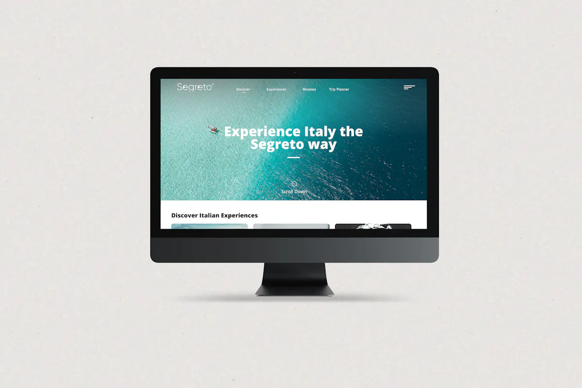
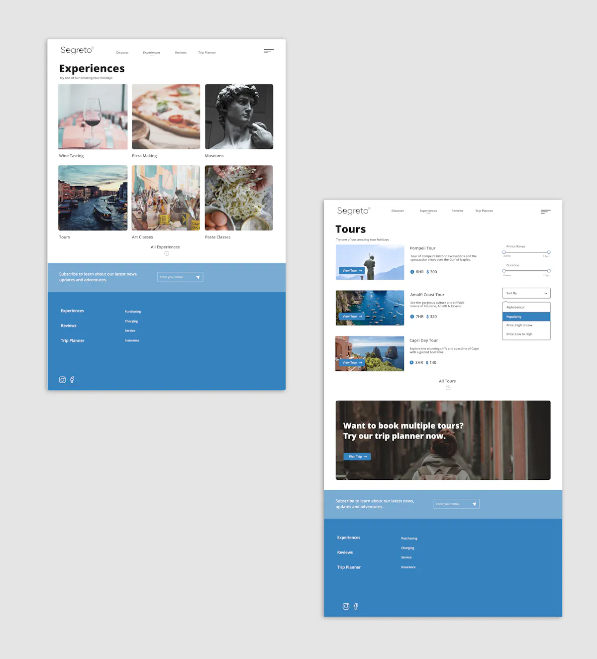
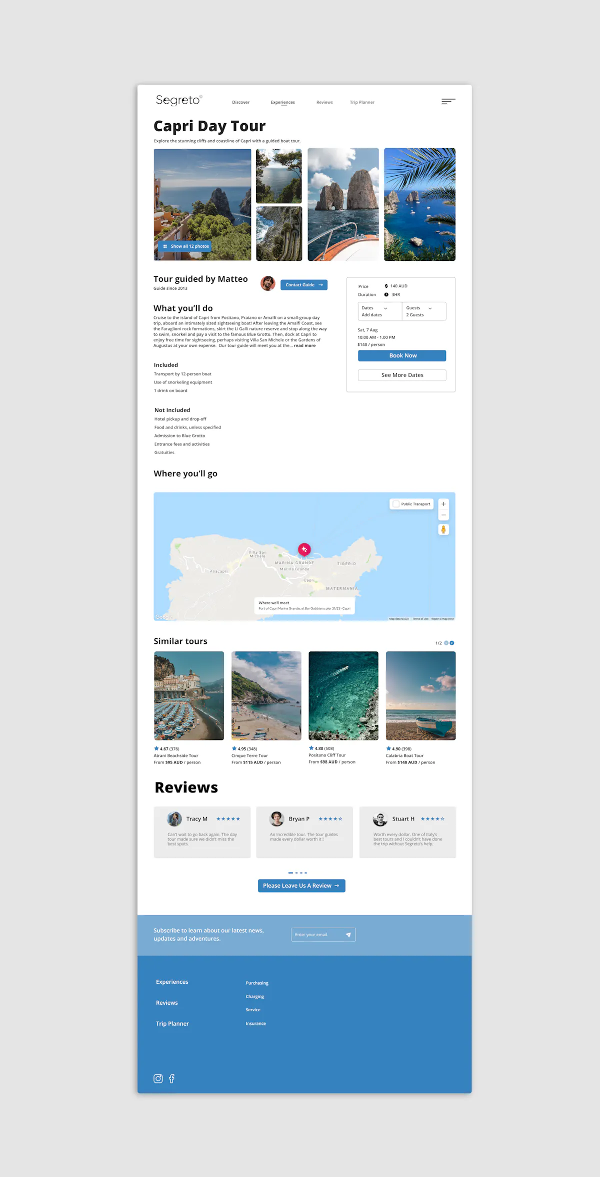
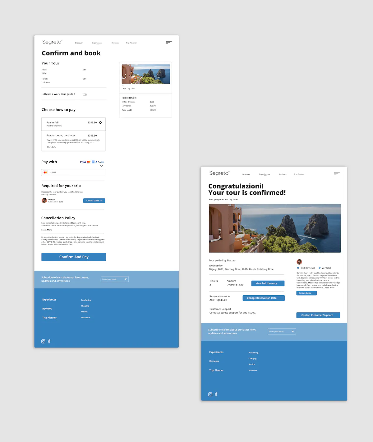
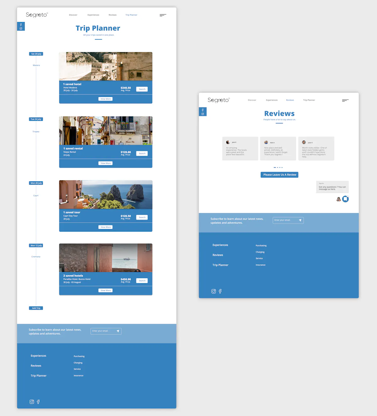
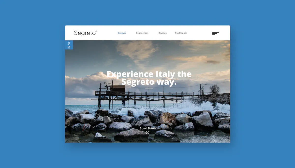
"Segreto", meaning secret in Italian. Is a travel-based website concept that focuses on helping users to travel around the hidden gems of Italy.
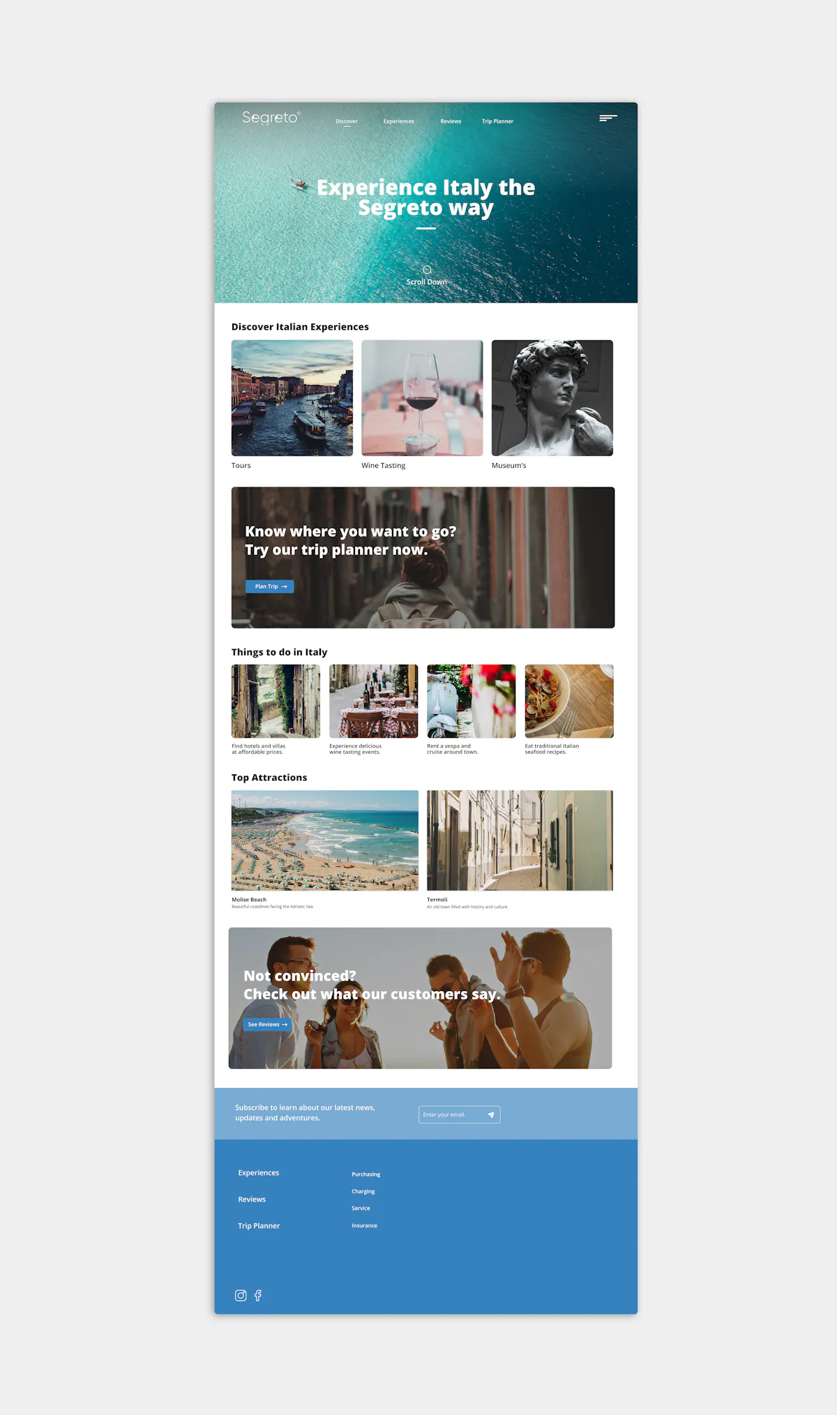
The website is meant to show a clean and attractive user interface placement with a simple and effective user experience.
Objective:
The goal of the site is to contrast to a range of travel websites that overwhelm the user with over cluttered options and an unappealing user interface. The website is meant to attract the user to the luxury and scenic tourism of italy with simple navigation and engaging interactions.
The Process
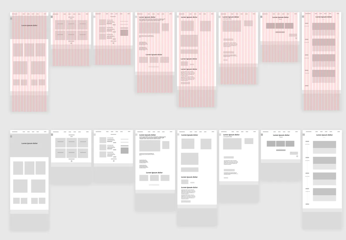
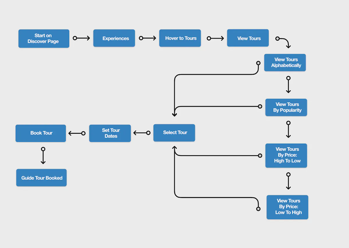
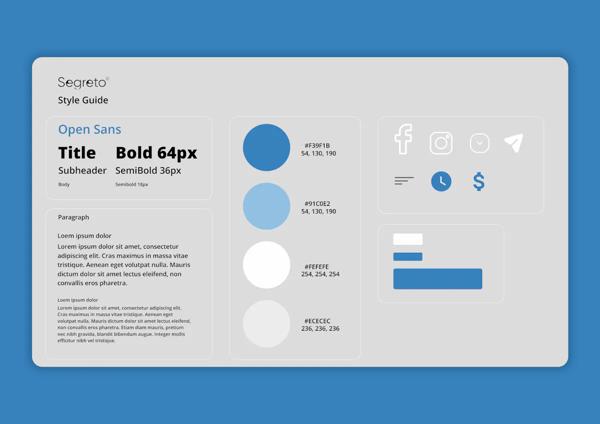
To execute the concept I created wireframes, a user flow and a style kit to make sure the project had a clear objective and consistency through each final mockup.
Traccia
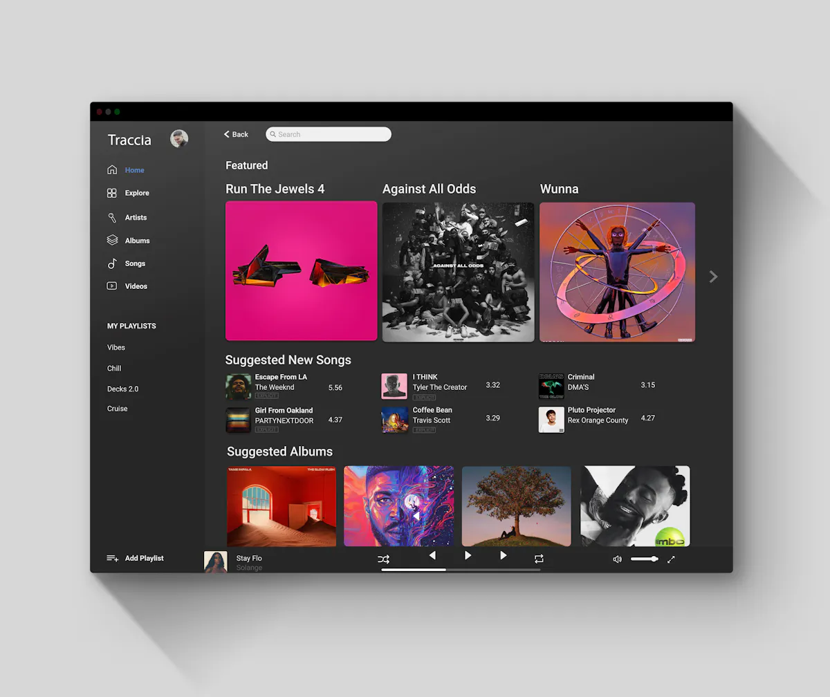
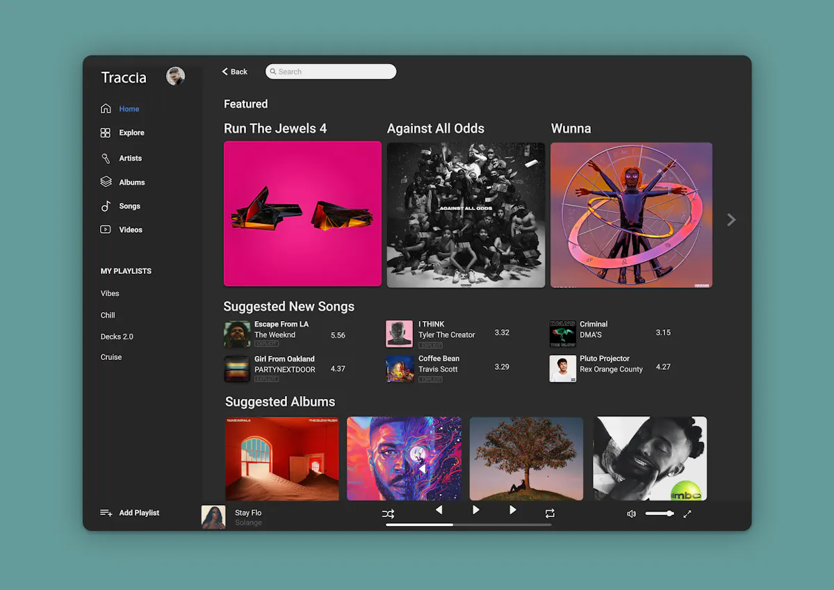
I recreated a streaming service desktop layout with a simple and effective dark interface.
This page was influenced by aspects of apple music and qobuz's desktop page. Both of these streaming websites have a minimal style with heavy use of white space.
Objective:
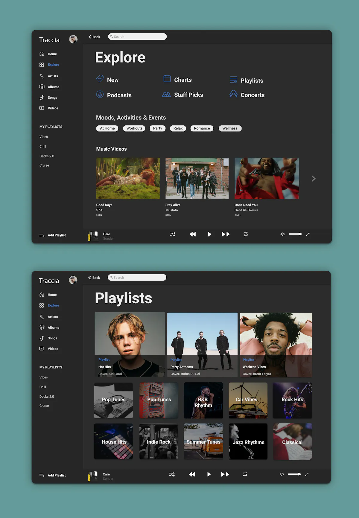
To create an effective explore page that allows the user to explore different and useful categories that are not repeated on other pages. The explore page is given a simple layout with iconography, buttons depicting moods, and new and popular music videos. These categories are poorly placed in other streaming services yet they are crucial to every user.
Streaming services such as Apple or Spotify provide a confusing explore page that mixes playlists, artists, albums, videos all into one. I believe this overwhelms the user and is an unnecessary amount of pages for the user to view.
Research Goals
I analysed key streaming services and how they used design patterns to resolve UI and UX problems for desktop software applications. These key services I researched were Spotify, Apple Music, Tidal & Quboz.
All these services provided adequate design hierarchy, branding, and interfaces for each page. A common problem found within these services however was the overuse of visual traffic on each page. Services such as Spotify and Tidal provided a confusing explore page that mixes playlists, artists, albums, videos all into one. I believe this overwhelms the user and is unnecessary when there are separate pages for each category already and is also highlighted on the user's home page.
Research Conclusion:
With each of these services displaying pages that are compacted and over-cluttered with options for the user, it made me shift my focus to creating an example of a user interface and experience that is simple and effective throughout each page without confusing the user to achieve their goal. Applications such as Apple Music were a stronger example of a minimal and effective layout that focuses on fewer visual elements and instead highlighting the one specific focus of each page.
Style Guide
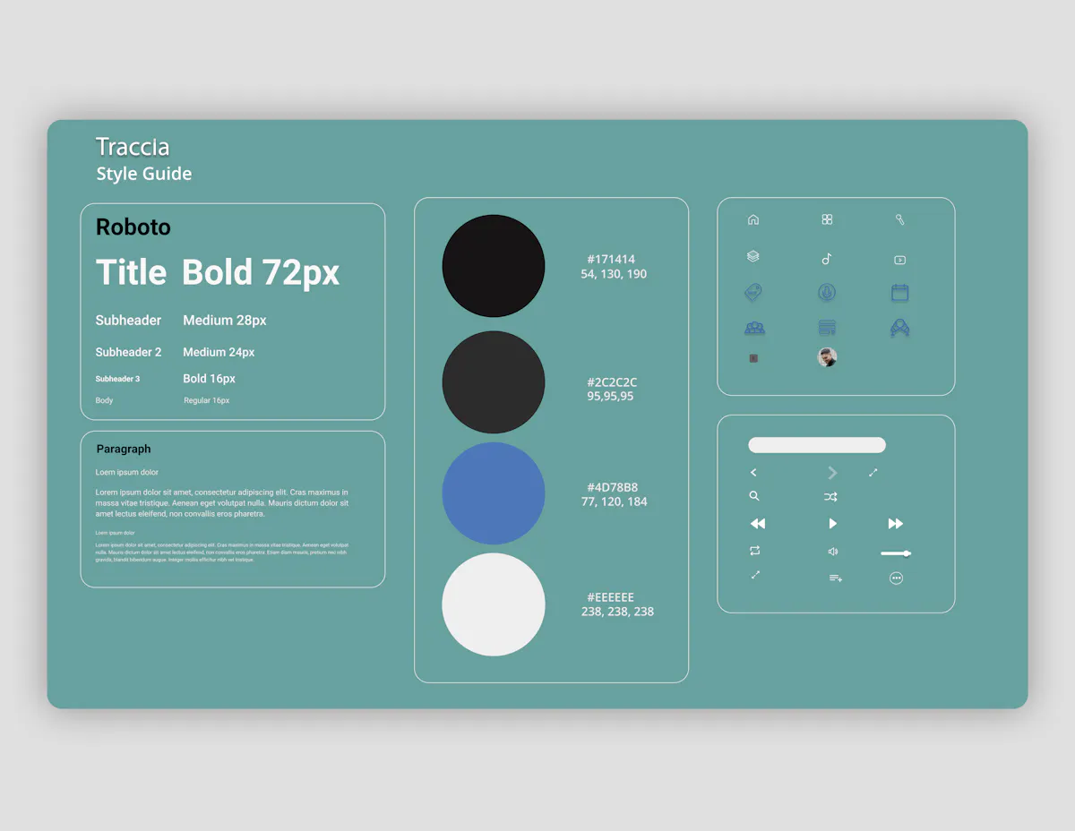
The style guide of Traccia focuses on the font use of Roboto as It's a modern typeface that has great flexibility of use and makes an improved experience for the reader.
The use of a dark interface was selected as I believe it is easier on the user's eyes. A dark interface creates a higher level of visual comfort as it allows the UI elements to further stand out.
The primary colour consist's of a black grain colour to support the desktop application's dark interface and is supported with an off-black shade that's used for the side navigation bar, mini player and top search bar.
The secondary colours consist of an off-white colour for all primary text, a light cloudy grey for the supporting text and a medium blue for the selected text. All these colours show strong contrast with the dark interface and are strong in readability for the user.
User Flow
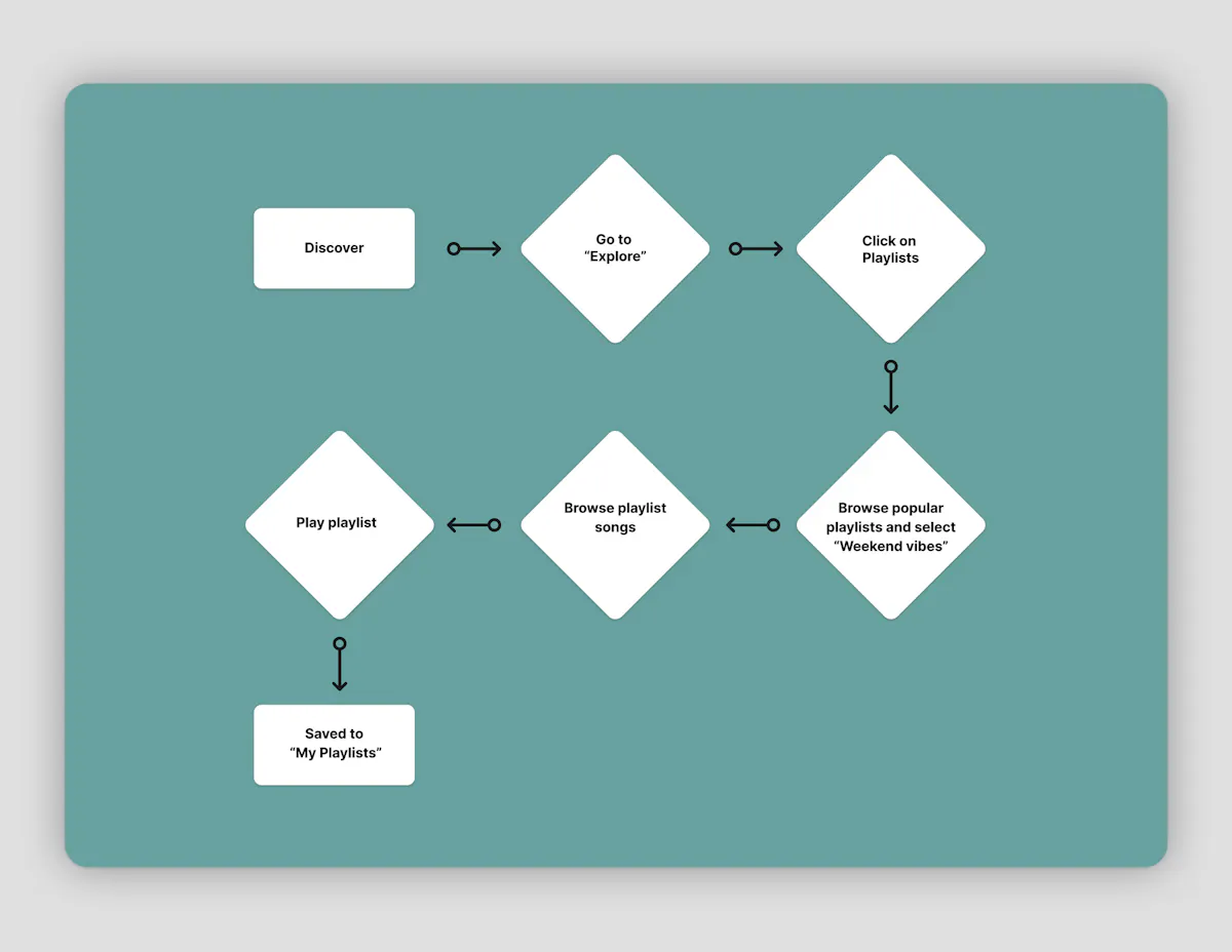
This user flow depicts the user going through the process of viewing the explore page and then proceeding to select a popular playlist and save it to their personalised playlist collection.
This user flow was created as I feel playlists are a crucial part of streaming services and to provide an effective playlist interface and experience for the user shows a key strength and understanding of the user streaming demographic.
Wireframes
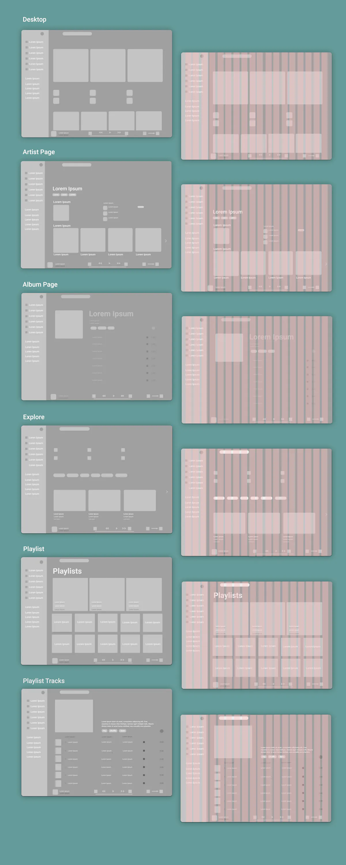
The wireframes for the Traccia desktop software application were created as an early attempt to develop content and establish placement of the content hierarchy through each page.
The general layout of Traccia is a cross between Apple Music and Spotify's desktop page. Both of these streaming websites have minimal style with strong use of negative space. The wireframes were created with an 18 Column Grid.
The desktop page is heavy image based with it displaying the current trending albums, songs and user specific album suggestions. The dominant feature of trends is ideal for the desktop page as it highlights the application's reliability. The hierarchy is based on displaying the most current trending music in largest image form in the top row, with songs placed at a contrasting smaller size and the album suggestions placed at a slightly larger size in a row of four. The side navigation bar was influenced from Tidal's navigation bar with the use of iconography supported with text in a range of different categories. I used this style as i felt other streaming services navigation bars were to broad and overwhelmed the user once on the following page.
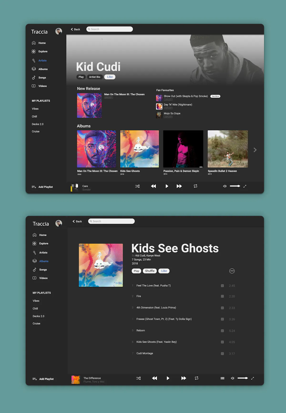
The artist and album page is heavily influenced from Apple's music artist and album pages as it has a strong use of negative space on the page to allow the user to focus purely on the artist's music content. The options on the artist page highlight there new releases, fan favourites and albums. The consistent use of negative space is shown in the album page to create sole focus on the album's tracks and no other conflicting content.
I've created an effective explore page that allows the user to explore difference and useful categories that are not repeated in other pages. The explore page is given a simple layout with iconography, buttons depicting moods and new and popular music videos. These categories are poorly placed in other streaming services yet they are crucial to every user.
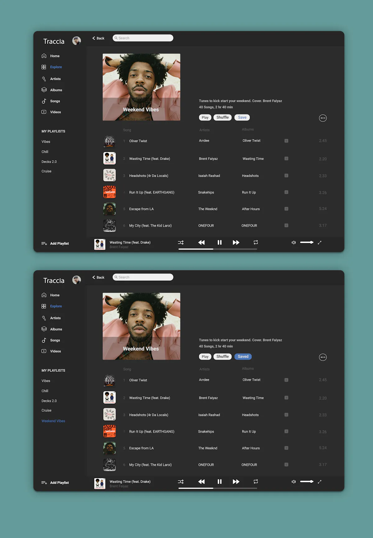
The playlists page, which is accessible through explore page is created in an effective way for the user to explore different playlist categories within the streaming service. Each playlist is highlighted with a text describing the genre or activity related to the playlist. The playlist track page has a similiar layout to the albums page with strong use of negative space to create focus on each unique track. The use of the save button is also a key addition to the user as it gives the them the ability to add the playlist to their "My Playlists" section placed on the side bar navigation.
DOOK Mobile App (Definition Of Original Kicks)
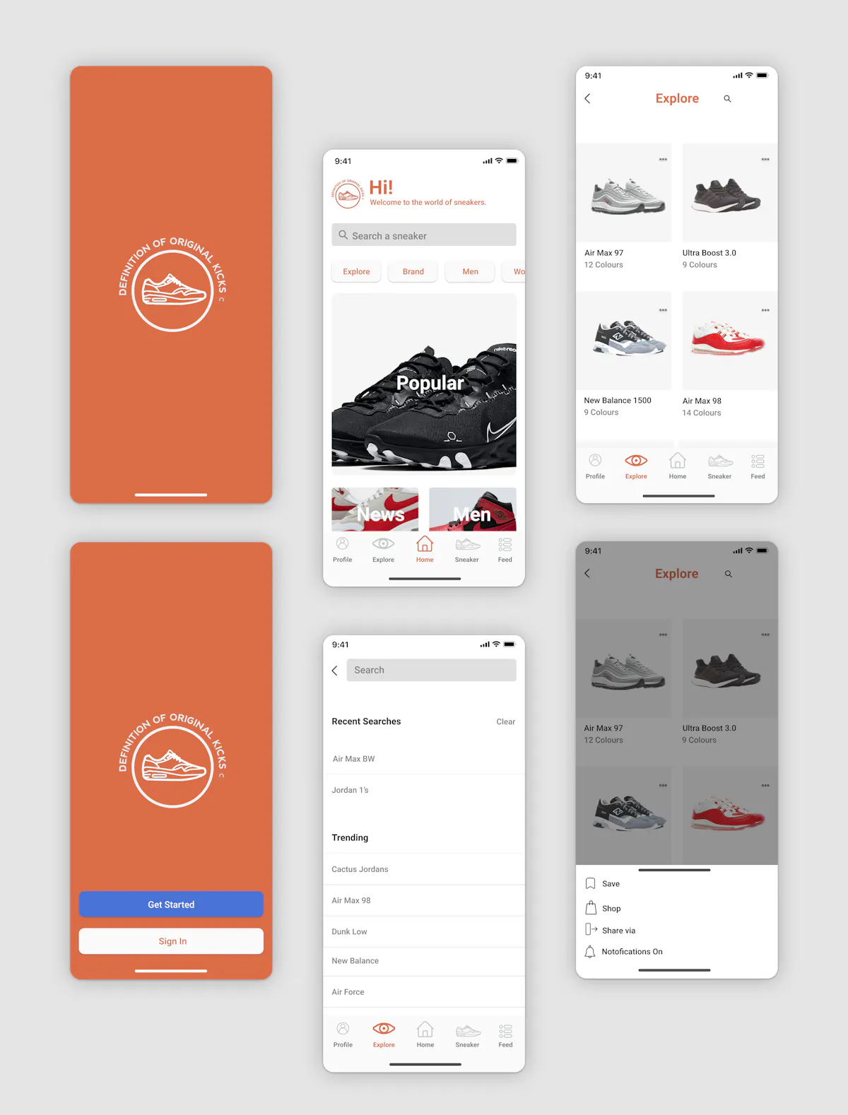
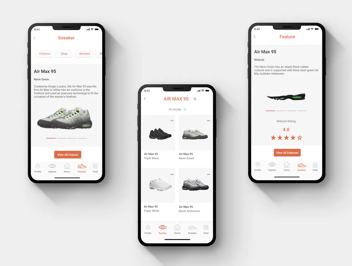
The DOOK app is a self-guide to the world of sneakers that keeps the user up to date with in-depth information on the anatomy of trending sneakers, release dates, and global sneaker news.
Objective:
To create an ios app with an effective interface that provides the user with in-depth information on any specific sneaker and an analysis of the shoe's quality and material reliability rather than just an analysis of the shoe's retail price, concept, and colourway description.
Research Goals
I researched popular sneaker-based iOS applications to understand how they resolved mobile application problems with design patterns to create appealing and functional interfaces that help the user keep updated and engaged in the growing and over-saturated platform of sneaker news.
I researched five sneaker ios apps that dominate the retail category in the app store. With face-to-face retail shopping becoming less common, mobile sneaker shopping and shoe apps have become the place to go obtain purchases and keep up to date with weekly sneaker releases. An effective sneaker app can make all the difference to a user's understanding of the sneaker market, trends, and news with applications such as GOAT, Stock X, Grailed, JD and Nike SNKRS showing a range of effective design patterns to guide their user's.
A common consistency between apps such as GOAT. Stock X and Nike SNKRS is the focus to highlight and give the user the ability to view and see each sneaker product in a clear and effective way by providing them with a zoom-in option, angle view slider, or a 3D rotation of certain sneakers. These apps also provide a simple navigation style and use a good balance of colour and negative space to support the images.
Although the Grailed and JD app provide a large amount of sneaker and product options for the user the design patterns they use appear to be disorganized and over-cluttered with a clashing style of user button options and images making the app's harder to navigate through and less appealing.
Research Conclusion:
Although these apps provide the user with a large quantity of retail information, purchase options and sneaker release news, they all lack a focus on an expert and user rating on the shoe's material quality and wear reliability.
This gave me the direction to focus on creating an app that aims at providing the user with not only extensive information on the sneakers retail information but also the material, quality and anatomy of each individual sneaker. With an intuitive but simple navigation style, this can get the user engaged in the app's ability to provide a unique analysis of each trending and popular sneaker.
Style Guide
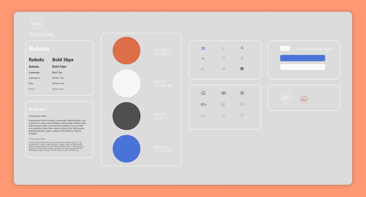
The primary font for DOOK is the staple 'Roboto' font. This font was picked due to its open and friendly curve that makes the reading rhythm more natural and inviting for mobile users. All font sizes were influenced and aligned with the iOS human interface guidelines.
For the primary colour I chose an orange salamander shade. I chose this colour as I believe it creates a vibrant and warm tone to the app's interface style and branding. The colour orange is also known to be associated with the sense of good value and is user friendly to both male and female users. The use of orange is in the headings, contained buttons and bottom navigation iconography to highlight the important elements of each page. The use of white as the second primary colour is used to accent and further emphasise the brands signature orange shade.
A black grain colour is used for all primary text and a secondary colour of light grey is used to support each image and iconography. The use of grey is hugely important to each design pattern as you can incorporate grey to divide white sections without complicating each image or design.
For the iconography, I created thin-lined designs as I felt it created a more minimal and clean effect for the general layout. All designs were created on Adobe Illustrator.
User Flow
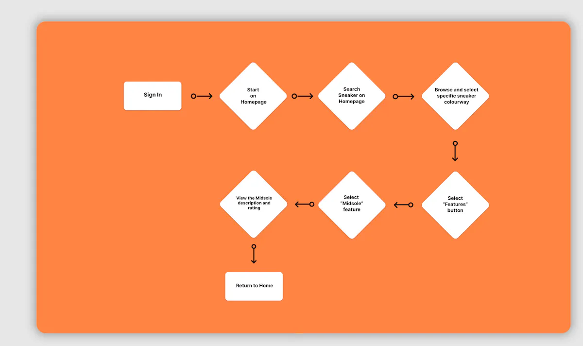
The user flow focuses on the individual looking to find the midsole feature of a specific shoe and to view its midsole description and rating. This process show's the applications unique ability to show the user an in-depth analysis and quality rating of each part of the shoe. This helps the user decide if the product is worth the purchase or not.
Wireframes
Each wireframe was created on a 4 Column Grid with a 16 px margin gap.
The homepage's key focus is inspired by the ASOS retail app, which uses a clean white bold text over the image to make the option readable and strongly emphasised. The use of the search bar is also supported with a contained button slide option underneath to take the user to a range of specific pages within the app. I believe these elements are crucial to any retail app homepage.
The Explore is Inspired by Nike's SNKR app. A clean and minimal style that uses a simple grey square background to contrast well with each product. I used inspiration from the Nike app as it's an effective design pattern that helps the user explore the content easily. Instead of over cluttering the page it allows the user to view only up to 4 products at a time. I believe this is a much more efficient way as it does not overwhelm the user with options.
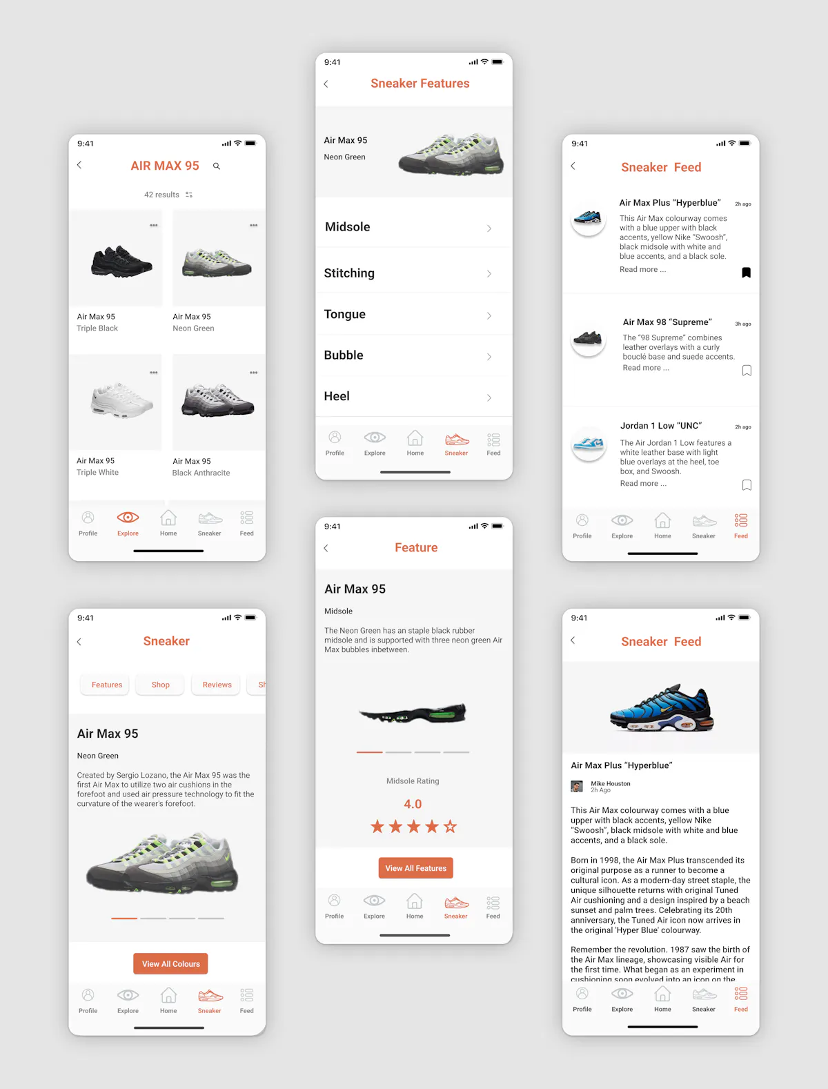
The key element of the Selected Sneaker page is the angle view slider which allows the user to see a different view and angle of each shoe. This button style is influenced by the GOAT and Nike SNKR apps. I used this as I believe it gives the user a clear understanding of which product they are viewing. The page is also again supported with a contained button slide option to allow the user to choose a range of options related to the sneaker. A view all colours button highlighted below the shoe is also used to give the user the option to see various models of the specific sneaker.
News Feed was inspired by the "Gawq" mobile news app. The app has a clean layout with three columns. The use of three columns creates effective readability for the user and allows them to view each article preview with ease. The article preview text is supported with an image preview icon to the left which displays the sneaker in a topic and a bookmark logo to the bottom right to give the user the option to save the news article. These elements were inspired by article applications such as the Gawq and the Sydney Morning Herald. The News Article page is a simple layout with an image banner on top, with the article editor icon and text below. This pattern is inspired by a range of article apps such as Apple News the Sydney Morning Herald.
The sneaker features application is strongly based on the Nike SNKRS app which displays with strong use of white space and large bold text as options. The page has a top banner grey background with the specific shoe aligned to the right to signify the chosen sneaker and its features below.
The key element of the selected feature page is the app rating system. The five-star rating element which is placed below the image of the feature was created to give the user an expert opinion and rating of the feature. The DOOK rating system's desired effect is to give the user a clear opinion of the shoe's worth and quality before a purchase.

